In this tutorial, we will make a layout similar to the effect you'd find on Windows Vista. We can use this concept that we will going to learn on website design, powerpoint presentations, and virtually anything that needs a layout with the sleek Vista style such as shown below. In this tutorial, we'll use Photoshop as a tool, but basically, any graphics editing program will work just as nicely.
To describe the finished layout, what we have is a great background, then a foreground layout that consisted of a white and opaque header which seems to blur the background image behind it, and the content area colored in opaque black that darkens the background image behind it. We also included sample texts.
The first step would then be to look for a suitable background image with a decent resolution. In this example, we used the Vista-Grass image that is included on a Vista installation. We are going to use this for this Vista-style layout tutorial.
Then, choose the rounded rectangle tool from your Photoshop tools at the left side. After choosing the tool, make a selection of the rounded rectangle to find the content area. After making the shape, right-click and choose Make New Selection.
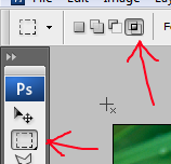
Then let's choose the Selection Tool from your Photoshop tools at the left side. Then choose Intersect option for the Selection Tool. Intersect means that the intersecting parts of your current selection and a previous selection, will result into a new single selection. So now, I guess you get the idea.
Right, we make a rectangular selection on the previous rounded rectangle selection that we had from earlier steps, only that we exclude the lower part of it so that we will not include the rounded corners at the bottom.
Before we do anything to our new selection, let's fill it with color, in this tutorial, we chose white so proceed to choose the Fill Color tool at your Photoshop tools as shown.
Then make sure that before you apply the Fill Color, you set it's opacity to around 61% so that the header will have a see-through effect to the background image.
Now, let's add the blur effect. As shown in the above screenshot, it's a simply Gaussian Blur. Just play with its settings and decide for yourself the right combinations.
You should have this effect right now. So the remaining task is for the dark content area. Just do the same steps you did for the header EXCEPT the Gaussian Blur and that the fill color is Black or Dark Gray.
After adding some text, we have now an amazing layout great for any content. It also works great with images! Notice by the way, that for a dark background, you need a light colored text, or in other words, good contrast that is for readability purposes.
Now start making your websites, powerpoint presentation slides, or whatever layout you can think of, and practice your photoshop skills!
I hope you learned something from this. If you have comments or questions, please post it here or you can send me an email at adriantheelite@yahoo.com. Thanks!


No comments:
Post a Comment