Showing posts with label web graphics. Show all posts

Saturday, June 12, 2010

How To Make a Glossy Vista-style button in Photoshop


Hi all, so now, what we're gonna make is another button that is Vista-style. The color scheme on this button is what you'll usually see on a button in Window's Vista Operating system, as shown below.


So let's get started. For this tutorial, we'll use photoshop, although other graphics editing softwares are equally capable of accomplishing this button too.


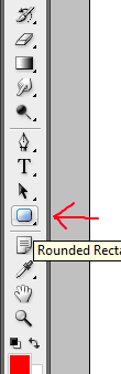
Choose the Rounded Rectangle tool as shown. We'll make an almost oblong shape by increasing the rounded corner radius.


In this example, we set the corner radius to 30 px, which in this example make both ends of the Rounded Rectangle seem like ends of an oblong shape.


Now, click and hold, then drag a shape on the canvass or the workarea and you should get a shape similar to the one above. After releasing the mouse button, right click on the shape and "Make New Selection" on it.


After that, choose the "Gradient" tool as shown above. If a "Paint Bucket Tool" is shown instead, click and hold your mouse over that tool and it will show a submenu showing the Gradient tool.


Choose "Color black" then the first gradient option from the upper left portion as shown above. You should have "Black to White Gradient".


Apply the gradient to your selection from Bottom to Top so you will have the effect as shown above. 


Now, we will have to select another selection to make the glossy parts of the button now. But before doing so, choose the "Selection Tool" or press its shortcut key of "M". Then choose the selection option of "Intersect" as shown on the image above. 


After doing so, make a rectangular selection on the upper half of the button. Because we have selected "Intersect", the points of intersection of the old selection and our rectangle selection will be our "New" selection.


This is our new selection. 


Now choose color "White" from the color palette. Then choose the "Gradient" tool with the second gradient option shown above, which is in this case, is "White to transparent".


Apply the gradient to the new selection, this time, from Top to Bottom to get the desired effect as shown.


You can add a blending option such as "Stroke" with a color similar to the color scheme of the button, you decide.


After adding some text, we finally got the Vista-style button.

I hope you enjoy this tutorial! Write me a feedback! Thanks!

How To Make a Glossy Web 2.0 Button or Icon for Websites


Hi all, I've finally got the time to make some web graphic element tutorials and for today, this is what we are going to make.

A glossy semi rectangular button, or icon, or label, whatever is your application for it. First of all, this is not limited to websites, as you can actually incorporate this to any GUI you are making, Power Point presentation you are presenting, your imagination's the limit.

For this tutorial, we'll use Adobe Photoshop CS3, but you can actually use virtually any graphics editor but the tools might differ slightly.
Before we begin, notice the icon, we'll call it icon throughout the tutorial. Notice that it has chamfered edges, its color is a gradient, and it has another white gradient that constitutes to its glossiness at the upper part of the graphic.

These 3 elements are the essence of the so-called Web 2.0 Graphic. So let's begin.


Choose the Rounded rectangle tool as shown above.


After choosing the rounded rectangle tool, adjust the radius of its rounded corners. The value above is not necessarily correct, you can try for yourself what works best for the size of icon or button you are making. As for this tutorial, I used 15 px.

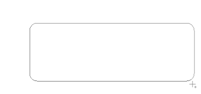
On your canvass, click and hold your mouse button and drag over the canvass to make a rounded rectangle shape as shown above. The size depends on your usage so it's up to you.

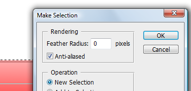
After making the shape, right click on it and choose "Make New Selection". The dialog shown above will display. Make sure you choose "New Selection" for the Operation, and click Ok.
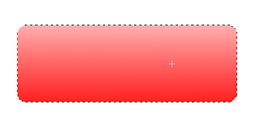
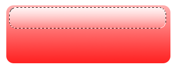
You now have a selection as evident by the broken lines representing the rounded rectangle.


Next step would be to choose the Gradient tool. If a Bucket-fill tool is on the choices, simply click and hold on the Bucket-fill tool so that a sub-menu will appear which will show the Gradient tool with the Icon as shown above.


Choose the gradient option for your Gradient Tool. Make sure it is as shown above, specifically, Color to White, or the one at the top-left-most gradient option. In this case, I chose color red so it is Red to White.

Make a bottom to top gradient on your rounded rectangle selection. Hold the "Shift" key so that the direction of the gradient is in perfect vertical or horizontal direction, in our case, vertical direction. You should get the effect as shown above. Darker color at the bottom and the top is nearing white, but still a shade of red.

Choose the Rounded rectangle tool again as what you did in the previous steps and make another Rounded rectangle selection on the inside of your first rounded rectangle. Position it in such a way as it its bottom is slightly above the middle part of the first rounded rectangle.

After making your inner Rounded Rectangle selection, right click and make a New Selection out of it. Then choose the "Gradient Tool" with the gradient option shown above. Color to Transparent, or the second one from top-left-most portion of the choices. ALSO MAKE SURE to choose the color "White" for your foreground color, so it's gonna be "White to Transparent" gradient.

After choosing the proper gradient options, hold and drag a gradient on your new Rounded rectangle selection, this time from "Top to Bottom". Don't forget to hold the "Shift" key. As you can see, we now have a glossy part of the icon or button that mixes nicely with the base color.

Now let's add some sample text to see if the icon is good enough.


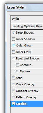
Now to add more effects, right click on the icon's layer and choose "Blending Options".


Let's add some "Drop shadows" on the icon's layer and you can play with the options. Also, choose "Stroke" and on its options, choose color white, play with the options such as "Position" and the dimensions to get the desired look.
We now have a very nice looking icon!
Now why don't you try some other shapes aside from Rounded Rectangle?
Have fun!

--Adrian D. Borja
-- follow me at twitter.com/elitesky